Okay, I need comments on this one. Besides the fact that this is an adorable picture (and no, it is not my daughter...I do have real clients) I am wondering what it looks like to you. The first one looks amazing to me, love the colors and brightness. The second one where I added my logo (YEAH), once I did that my computer made it look way too dark and dingy to me. But I also noticed that my pictures look way too bright or washed out on my sister and my SIL's computers. So please, how does it look to you on your computer, thanks in advance for any comments.
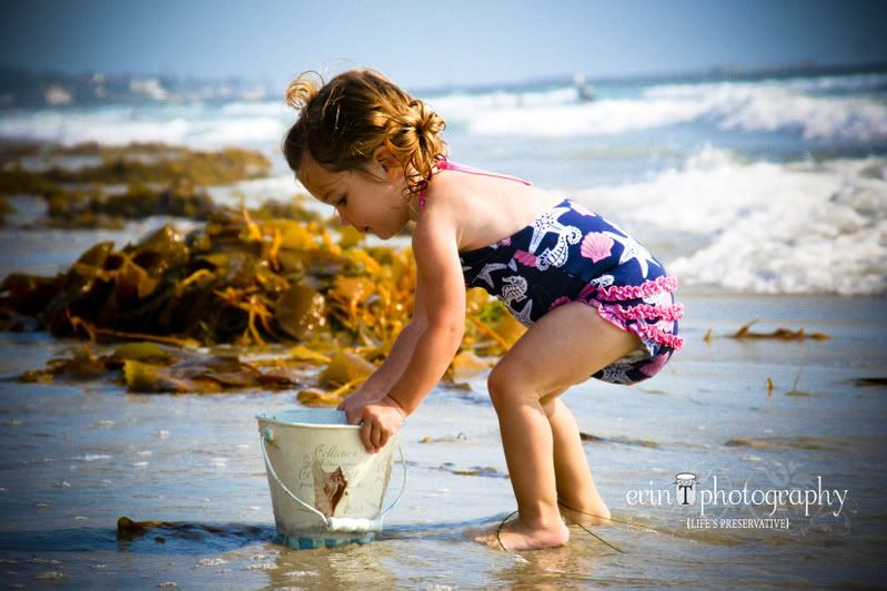
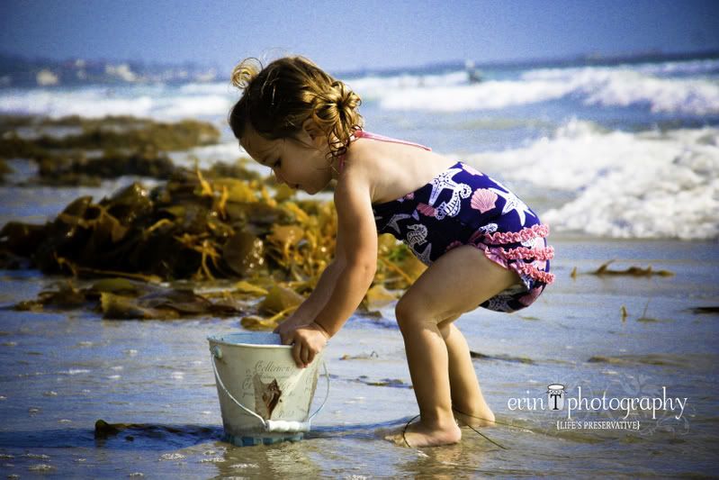


I think it must look the same on my computer as it does on yours. The first looks great but on the second the colors are all muted and dingy. Weird!
ReplyDeleteThe first Shot is great! The colors really pop. The second picture with your icon seems to have changed the color dinamics. Did you change the resolution when you pulled it into photo shop or what ever program you used to add the icon? I hope this is helpful.
ReplyDeleteThe first one is very bright and the second is obviously less bright but still good quality to me. But then again, I'm not a photographer with a critical eye.
ReplyDeleteThe color looks great on the first one. But the color did change on the second one (too green maybe). But it's not washed out. Everyone has their monitors settings different. That's a way cute picture!
ReplyDeletei agree with you, the first is better!
ReplyDeleteThese both look amazing on my computer! The color in the first one looks a little bolder, but they look great! I want to watch you do some picture editing on the computer sometime! What photo software program do you like?
ReplyDeleteErin it just looks a little vintage to me on my computer. I guess you could try to view it in different photo tools like shutterfly, picasa, flickr, and suc... and see if it looks differently there as well. You could use the warmify tool to bring back the warm sunlight to it. I use that on Picasa a lot for fall pictures. Your a gem...
ReplyDeleteAja
On my computer the second one looks like you desaturated it and a tad greenish. But I thought you had done that on purpose for the effect and it still looks great! love the logo!!!
ReplyDeleteHey-side note- me and fam will be down there this next week and would love to see you if you guys are free. plans are still undecided but I know we will be in San Diego on monday and thursday for sure. wed. or friday are good beach days for us if you guys want to get some sun. Let me know.
They are not washed out on my personal laptop. I have the same problem with my work laptop vs my personal laptop. when I green grass on my work laptop, it looks normal grass green, but when I send it to another computer, it looks lime green! Yuck!
ReplyDeleteOnly suggestion is to make sure your monitor is set to Adobe RGB color. It's the most standard and true to life coloring.
The second picture is a bit less saturated than the top. Pink in the bathing suit and orange in the seaweed. But it doesn't look bad or overly washed out! Minor differences. Great shot! Love the pail!!!
Okay, so I know I'm late in the game but, I cannot even view the first pose (or is it the 2nd?) Are they the same pose? I can see the one where the little girl is leaning down toward the pail. It looks cute to me! The ruffles are pink and the seaweed is green, the yucky green it normally is.
ReplyDeleteAnyway, cute pics and cute ideas! I may be asking you to do a shoot with me and my friend, Angela. She is getting married at the end of August at the Mission In (I'm one of her bridesmaids) and we have known each other since I was a Senior and she a Sophomore! In other words.... 14 years! Oh my gosh, that is a CRAZEE thought! I will be back down around the 27th of Aug. so, if it's okay with you and her, maybe the 28th. I don't know if she will have time since it's soooo close to the wedding! I will keep you posted! Maybe I can get her sisters and mom to do it, too! THAT would be way fun! I will let you know ASAP!
Both of these are so good! sooo cuuuuttee!
ReplyDeleteYou are so good at this, erin ......very talented!:)